Alethia
Branding & Album Design
Alethia, an independent Colombian artist based in Melbourne, Australia, embarks on a unique musical venture blending Latin, reggae, jazz, R&B, and soul. With heartfelt lyrics in English, her sound exudes a soft, jazzy, delicate ambience. Her music serves as a personal journal, capturing her reflections through lyrics sung in both English and Spanish, leaving an indelible mark on each composition.
Initially, Alethia sought the assistance of a design agency to create compelling visual content that would complement the release of her four concept albums. Each album delves into intimate stories, weaving a spiritual and emotional journey that resonates with listeners through the seven chakras, or energy centres.
Alethia's music transcends boundaries, offering a deeply personal and soul-stirring experience. Her artistry connects with audiences on a profound level, evoking emotions and inviting listeners to embark on their own transformative voyage.
Artist Branding
The first stage of the project focused on developing a distinct visual identity for emerging artist Alethia, creating a consistent and recognisable style across her brand assets.
Alethia’s brief and music informed the creative direction, with her sound distilled into four key words: ethereal, delicate, light, and airy.
These qualities shaped the typography, colour, imagery, and supporting graphic elements. The final identity reflects the softness and intricacy of her music while establishing a cohesive visual language that can be applied across digital, promotional, and release materials.
The result is an identity that feels closely aligned with Alethia’s sound and provides her audience with a clear visual introduction to her work.
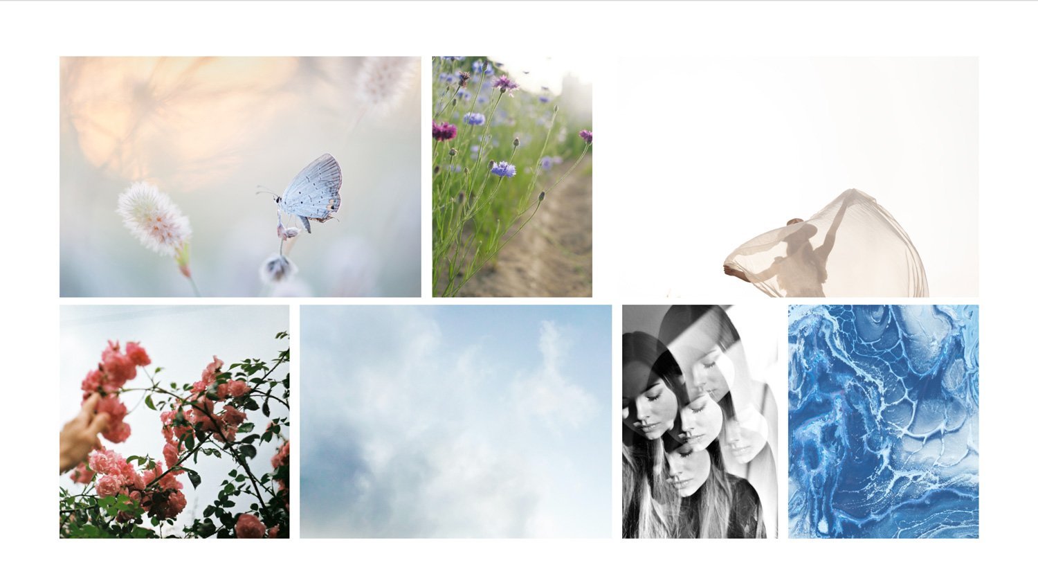
Primary Logo
For Alethia’s visual identity, a clean typeface was selected and subtly refined with soft curves to introduce a more whimsical feel. Simple line drawings of wildflowers were also incorporated as recurring motifs, drawing on natural forms to support the overall direction. Together, these elements create a distinctive, recognisable style that reflects the ethereal, delicate qualities of Alethia’s music.
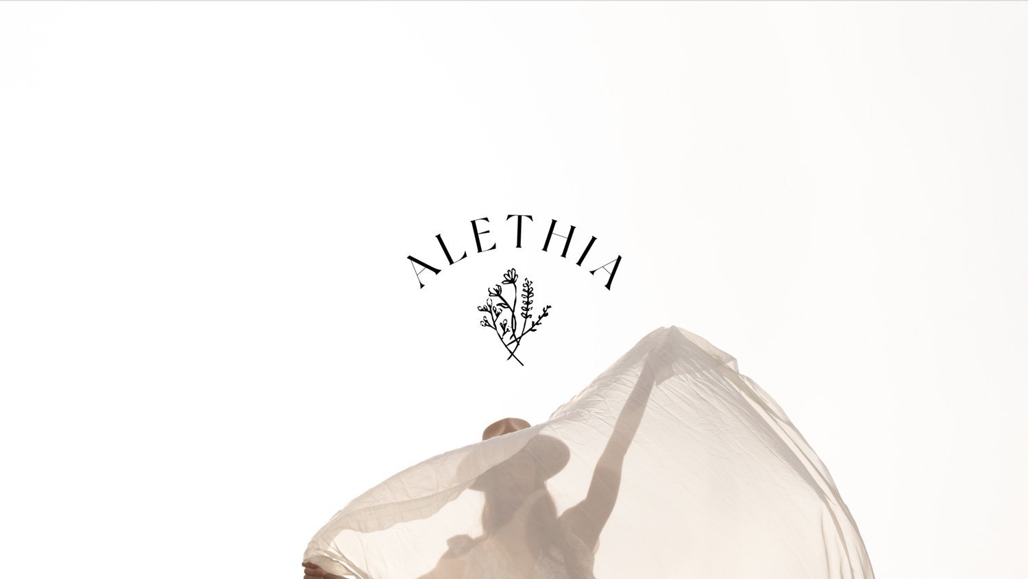
Secondary Logo
The secondary logo for Alethia's album covers features a script-like font that can be used in place of album or song titles. By combining a serif typeface with script lettering, the logo has a natural, organic feel that perfectly complements Alethia's music. This dynamic design adds a personalised touch to each album cover while maintaining a cohesive visual identity.

Album Design
Each of Alethia’s four album covers was designed to have its own distinct character while remaining connected to the broader visual identity.
Mood boards were developed to establish the direction for each release, followed by the design of the album artwork and animated GIFs for social media promotion. The final collection allows each cover to stand on its own while maintaining a consistent visual language across the project.
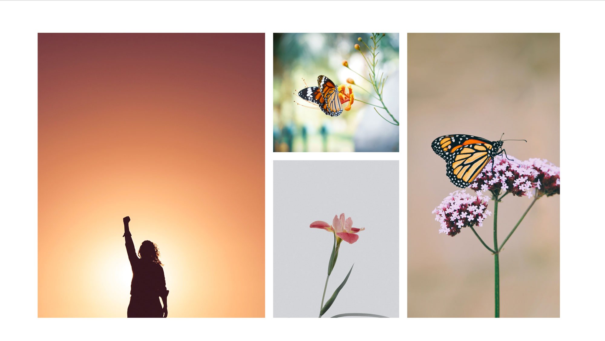
Hope
Capturing the idea of hope presented a unique challenge, as it is both abstract and deeply personal. The visual direction needed to feel recognisable without relying on overly familiar symbolism.
Butterflies became the central motif, used in a subtle rather than literal way. Through animation, they appear in motion, suggesting release, transformation, and freedom. This approach offered a simple but distinctive way to represent hope while staying consistent with the project’s wider visual language.
Love
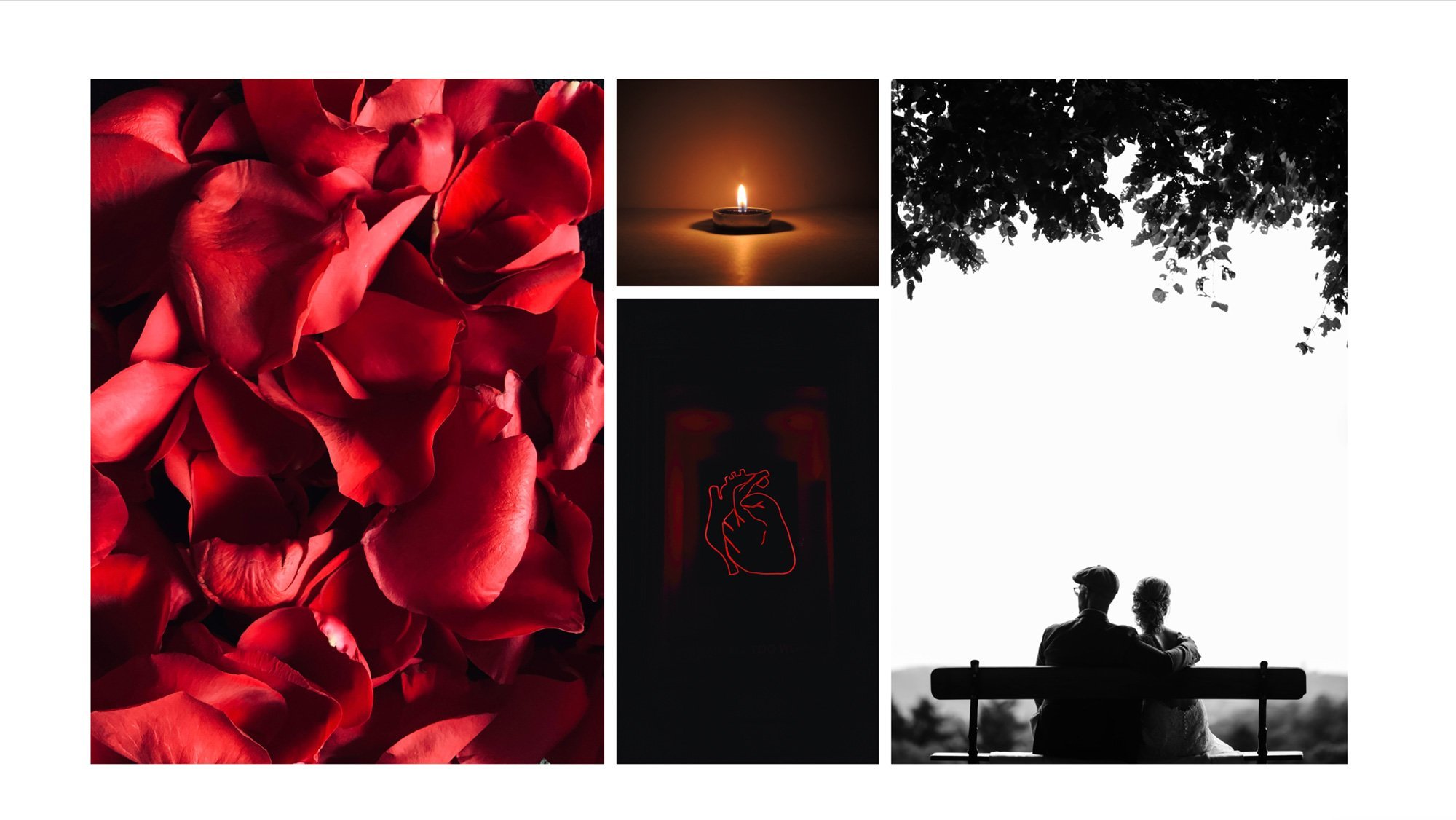
Alethia’s Love album explores the darker and more ambient sides of emotion, focusing on intimacy, vulnerability, and the complexity of human connection.
To reflect this visually, the concept moves away from the conventional heart symbol and instead takes a more metaphorical approach. Drawing on the idea of the chest as the place where the heart is held, the artwork uses this form to suggest emotion in a less literal way.
This approach creates a visual identity that feels more aligned with the album's mood, capturing its emotional depth while avoiding more familiar or expected imagery.
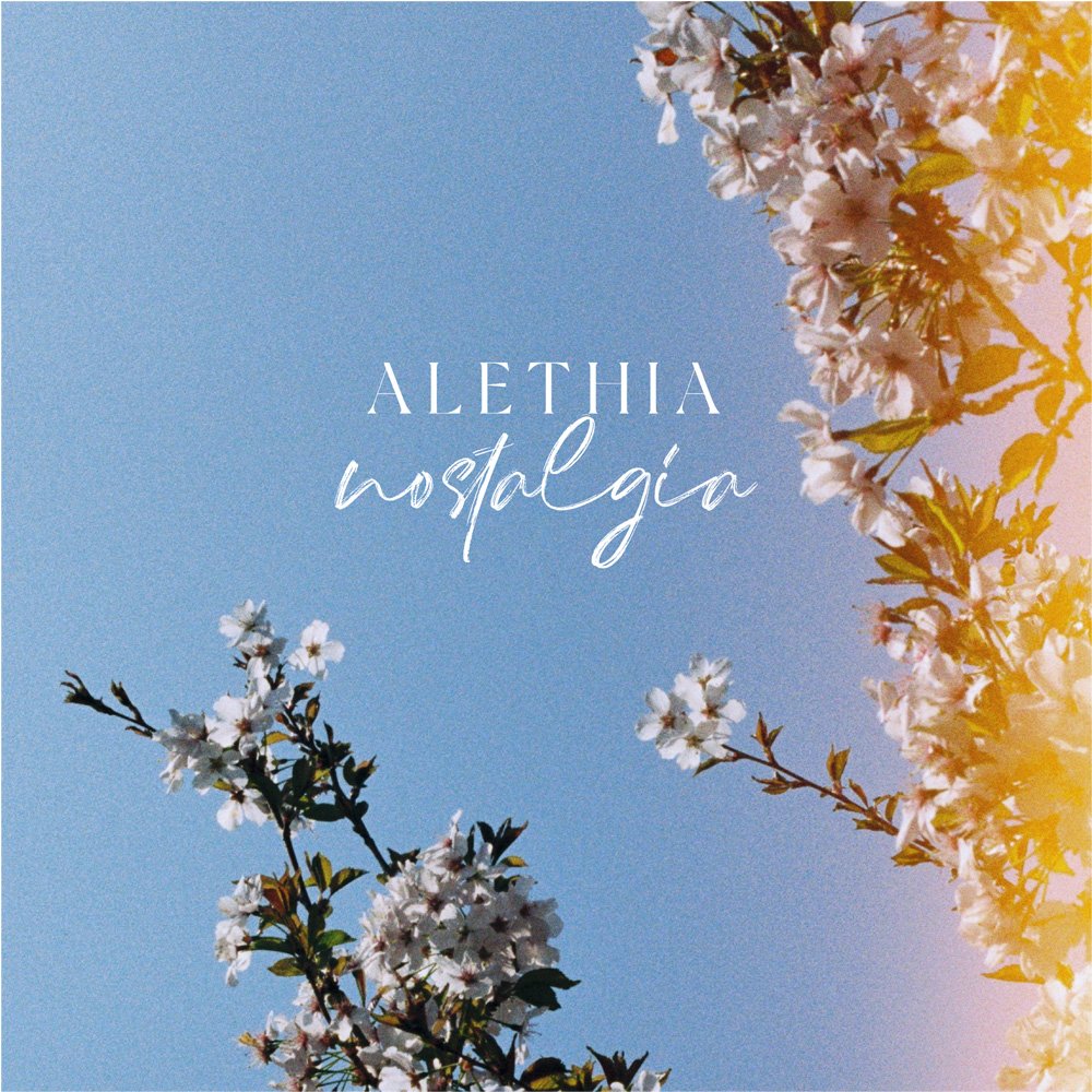
Nostalgia
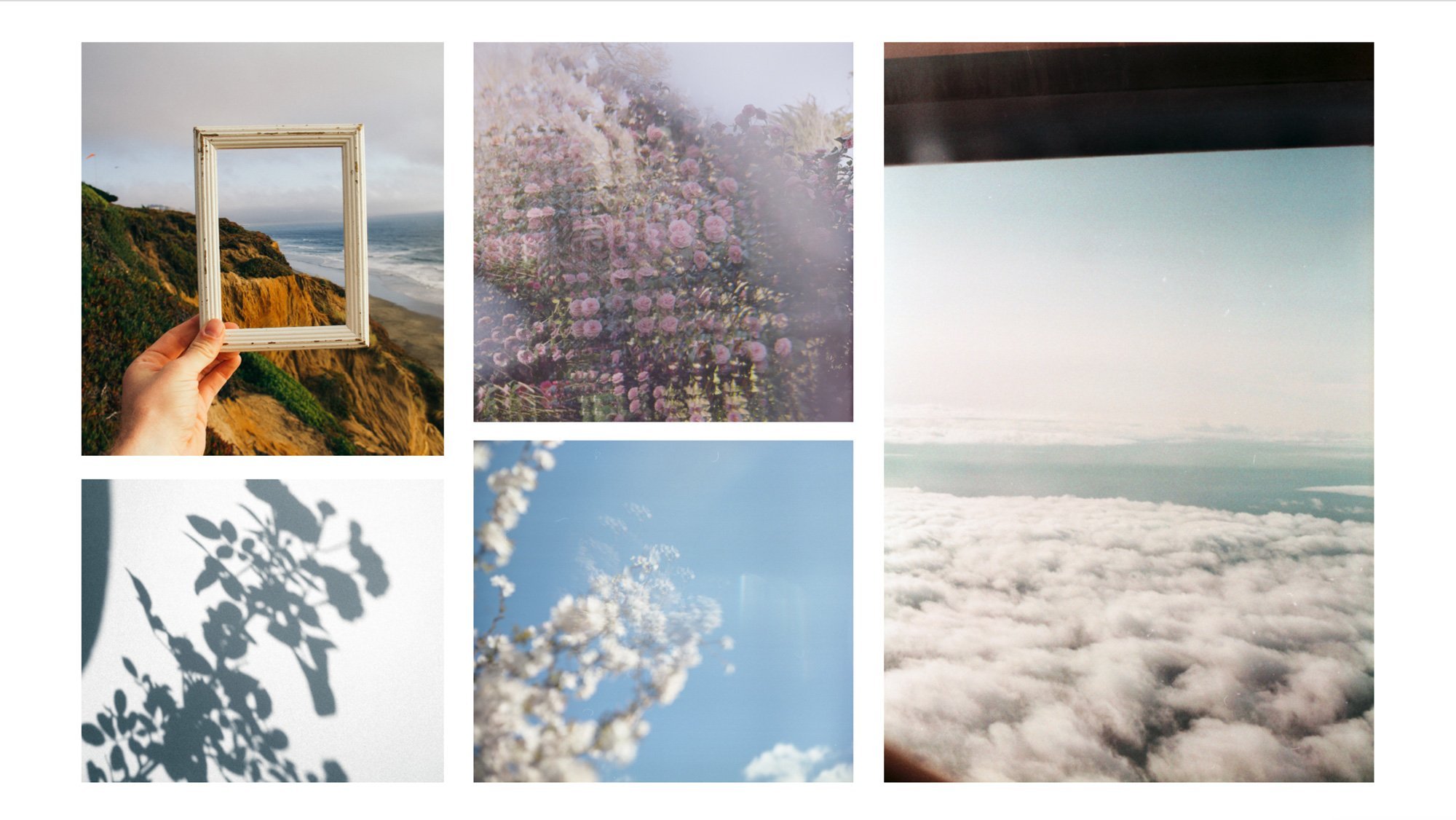
Nostalgia is difficult to represent visually because it is shaped by personal memories and experiences.
The concept focused on three recurring elements: photographs, memory, and the passing of time. Vintage imagery, layered compositions, and subtle references to ageing were used to create a reflective and slightly distant mood.
The final artwork complements the tone of Alethia’s music while leaving space for listeners to connect it with their own memories and experiences.
Roots
Alethia’s Roots album celebrates her Colombian heritage, drawing on the country’s colour, culture, and visual richness.
The artwork draws inspiration from stacked houses, intricate patterns, and floral forms often found in Colombian streetscapes. Through animation, these elements are brought to life with fine lines that grow through the architecture like roots, creating a visual metaphor for identity, belonging, and connection to heritage.
Vibrant colour and movement give the cover a strong sense of place while reflecting the energy and warmth at the centre of the album.

Final Product
The final collection was designed to feel cohesive while allowing each album to retain its own identity.
Darker palettes were used for the more ambient and introspective releases, reflecting their emotional depth and atmospheric sound. Brighter colours were introduced for the more upbeat and expressive albums, creating a stronger sense of energy and movement.
Consistent typography, illustration, and composition connect the four covers, while shifts in colour and imagery distinguish each release. The result is a unified visual system that reflects the changing moods of Alethia’s music without making the individual albums feel repetitive.