

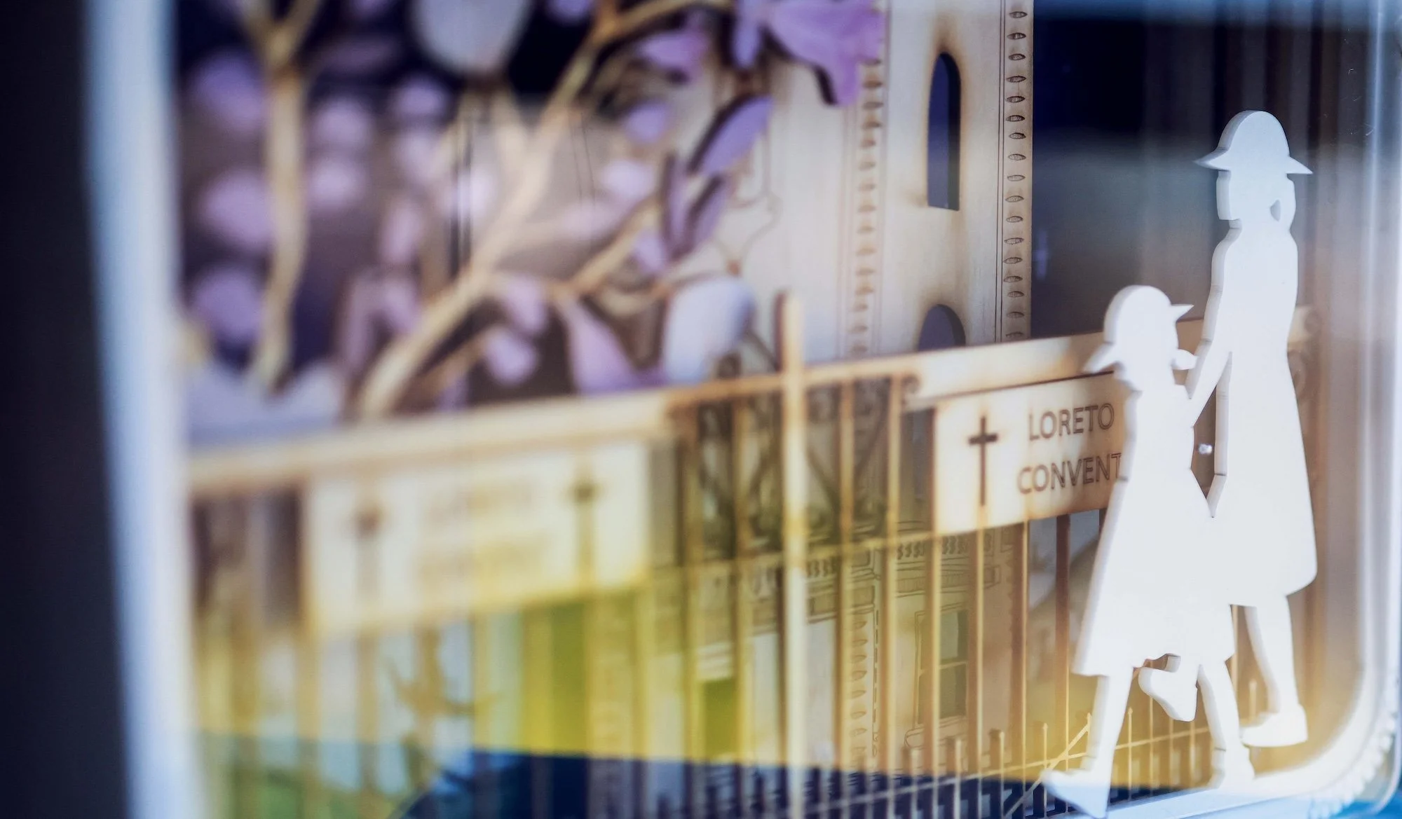

150 Years of Loreto in Australia
Publication Design
This project was undertaken in collaboration with Get You Known.
This project encompassed creative direction, editorial design, end-to-end project management, and print liaison for The Humble Idea, a 100+ page commemorative publication marking 150 years of Loreto in Australia and South East Asia.
The brief carried the weight of a sesquicentenary. We were asked to shape a single, coherent volume from an extraordinary breadth of material: archival photography spanning fifteen decades, original student artwork, commissioned poetry, a national travelling exhibition, theatrical productions, and the histories of eight schools. Each community held its own story and stake in the outcome. Our challenge was to honour every one of them without fragmenting the whole, and to translate a legacy of faith, education and quiet radicalism into a book that felt as considered as the institution behind it.
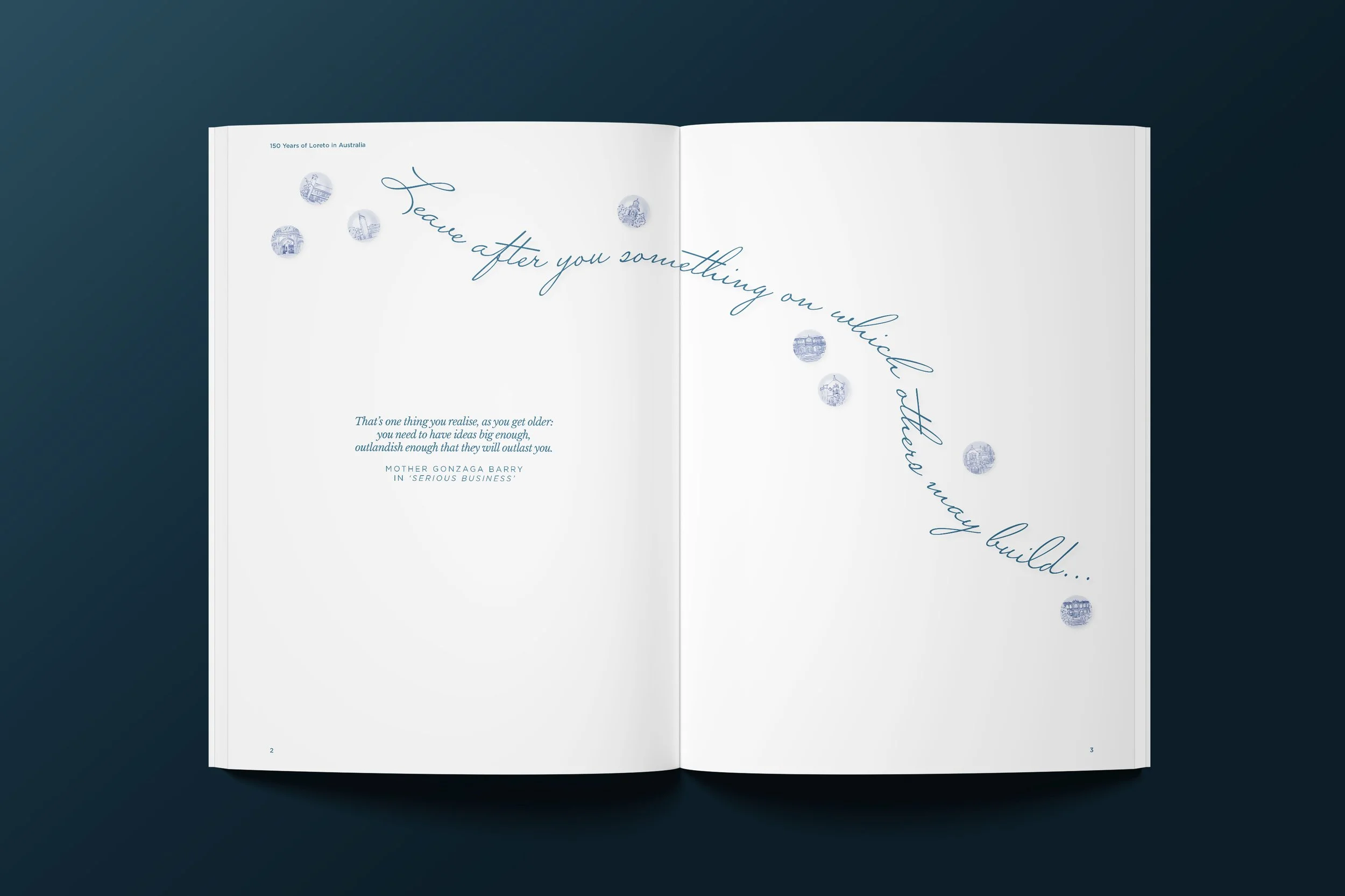
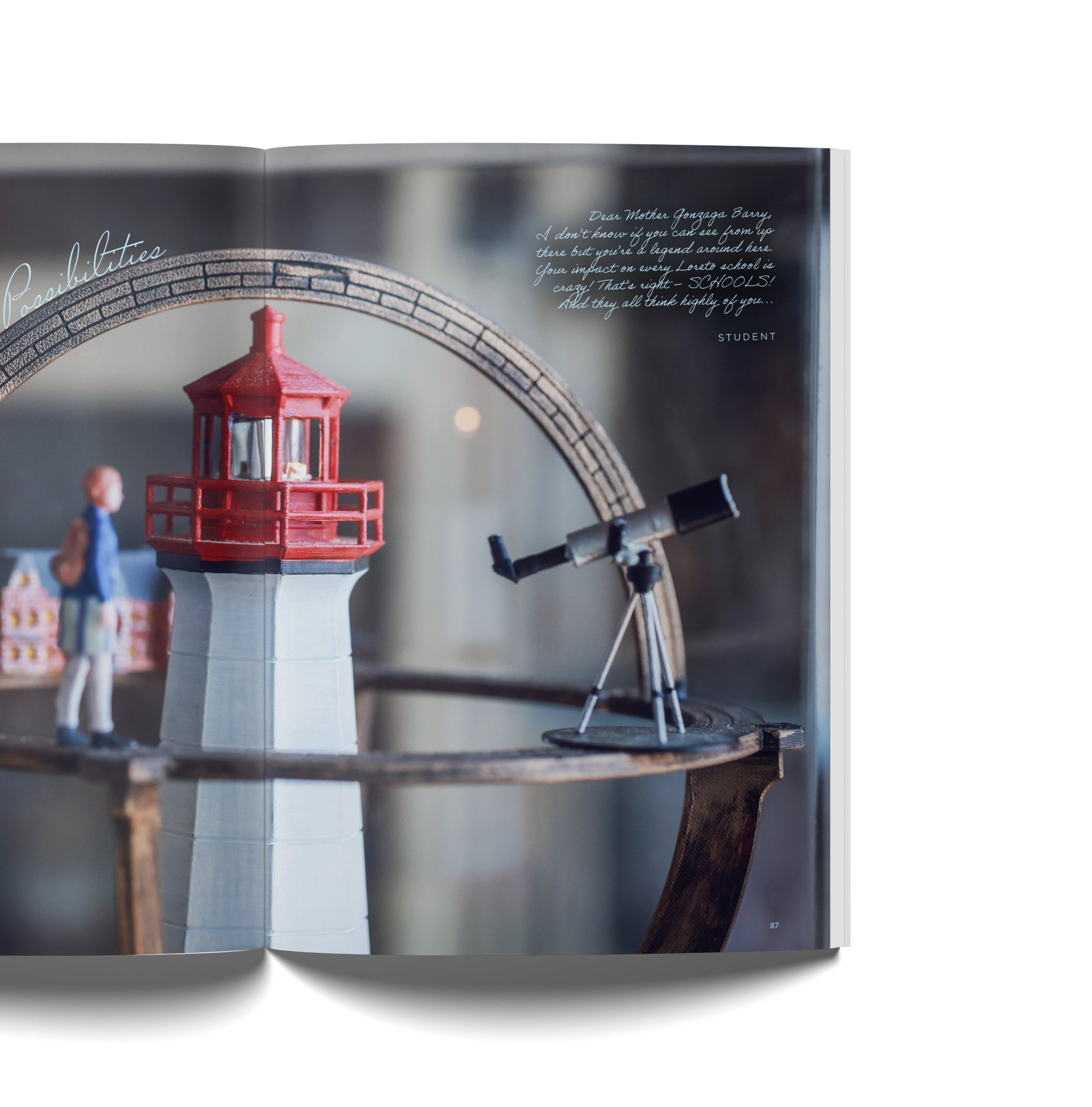
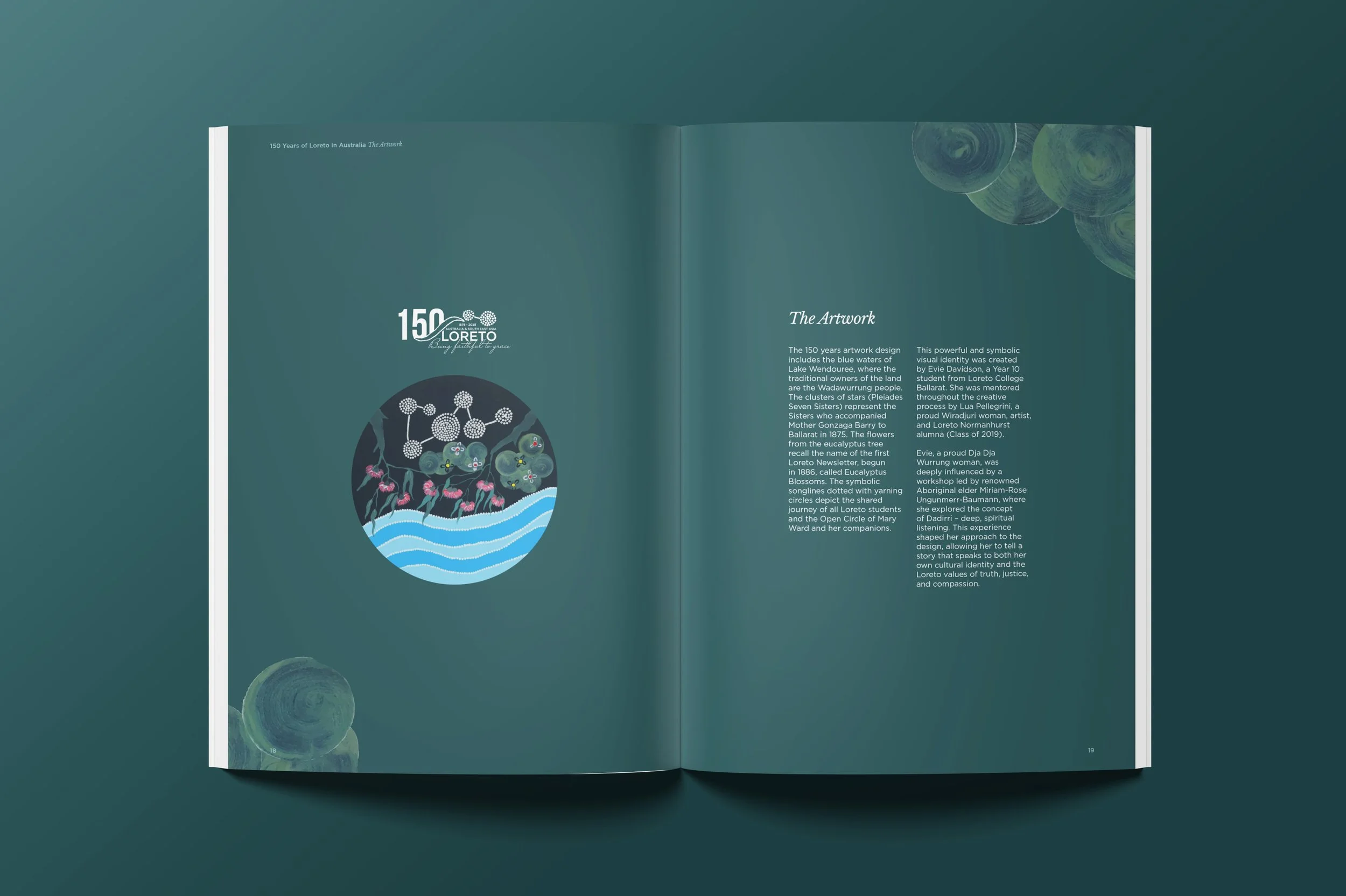
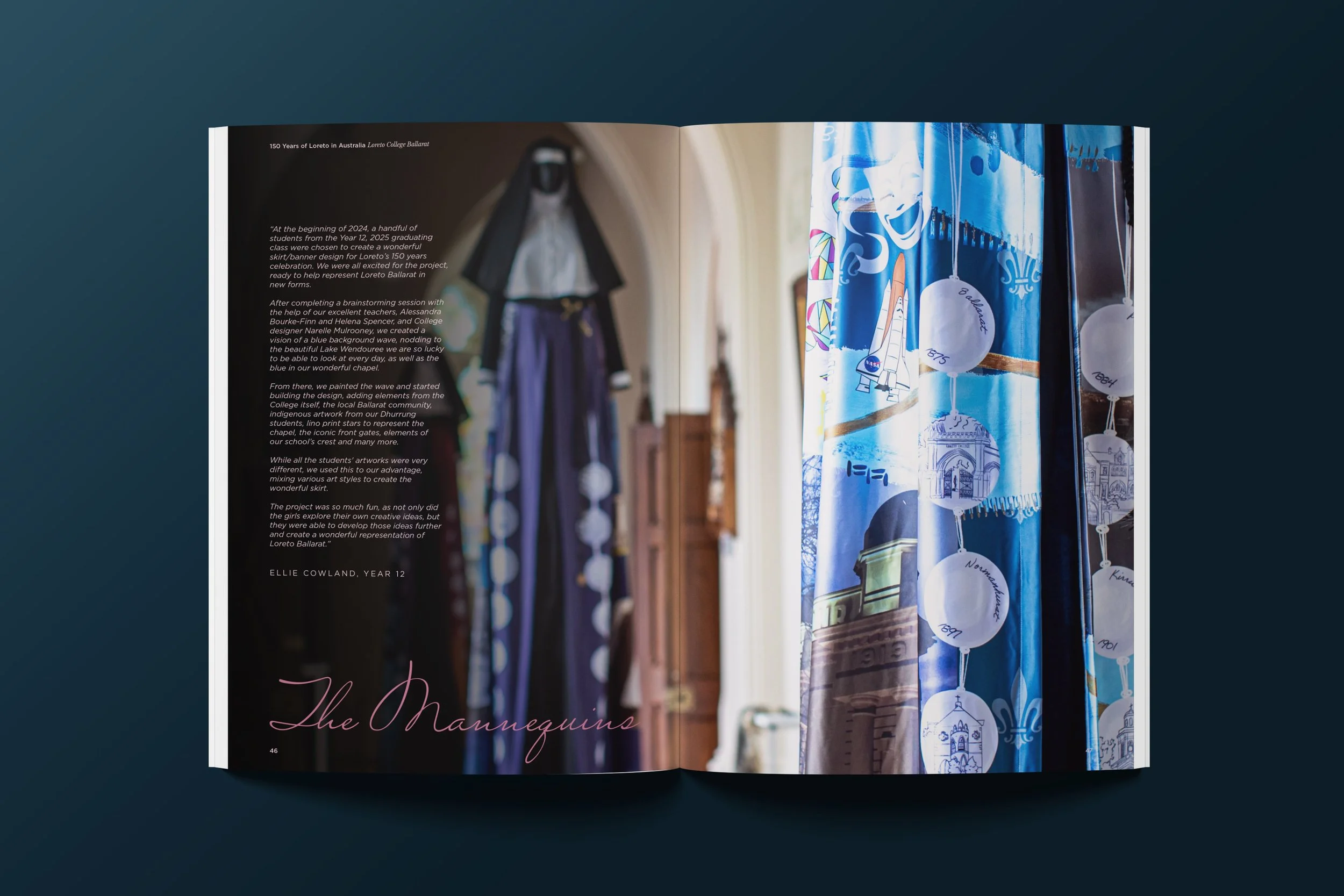
We built the creative direction around restraint and reverence. Drawn from the 150 years of Loreto in Australia logo, a palette of deep navy, mid-blue, dusty slate and soft blush moves through the book in full-bleed colour fields, giving each section its own atmosphere.
A hand-drawn script anchors the identity, appearing as the cover logotype and then recurring at scale as a tonal watermark across chapter openers. Clean, justified sans-serif body copy holds the historical narrative with clarity throughout.
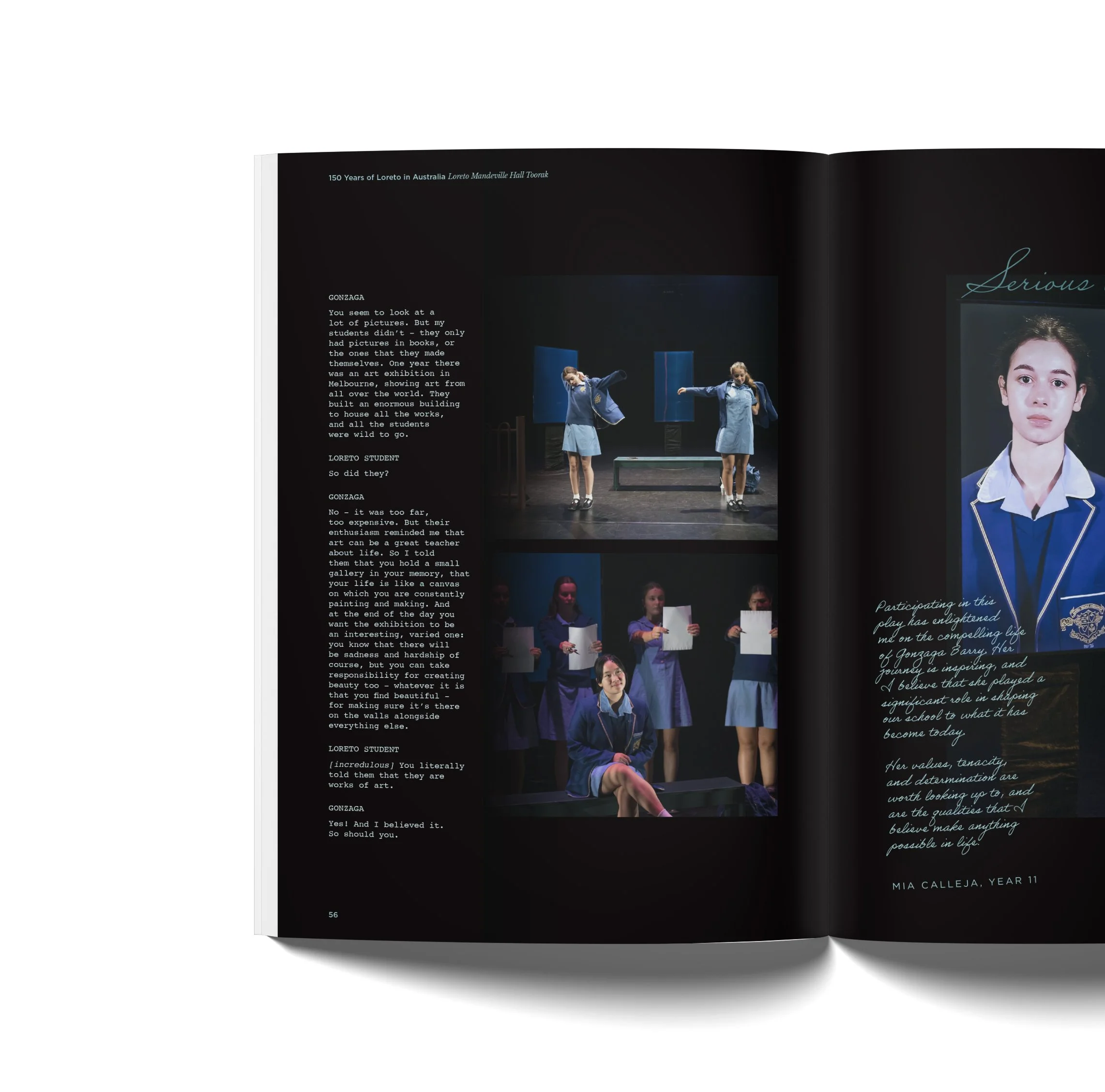
Where the book reproduces excerpts from Serious Business, we set the dialogue in a typewriter font, drawing on the visual language of the rehearsal script. The shift in register needs no explanation: the reader understands they have moved from historical account into performance and the words the students themselves spoke on stage.
Paired with production photography and the script's own line breaks and stage directions, the treatment gives the theatrical chapters a distinct identity within the wider volume.
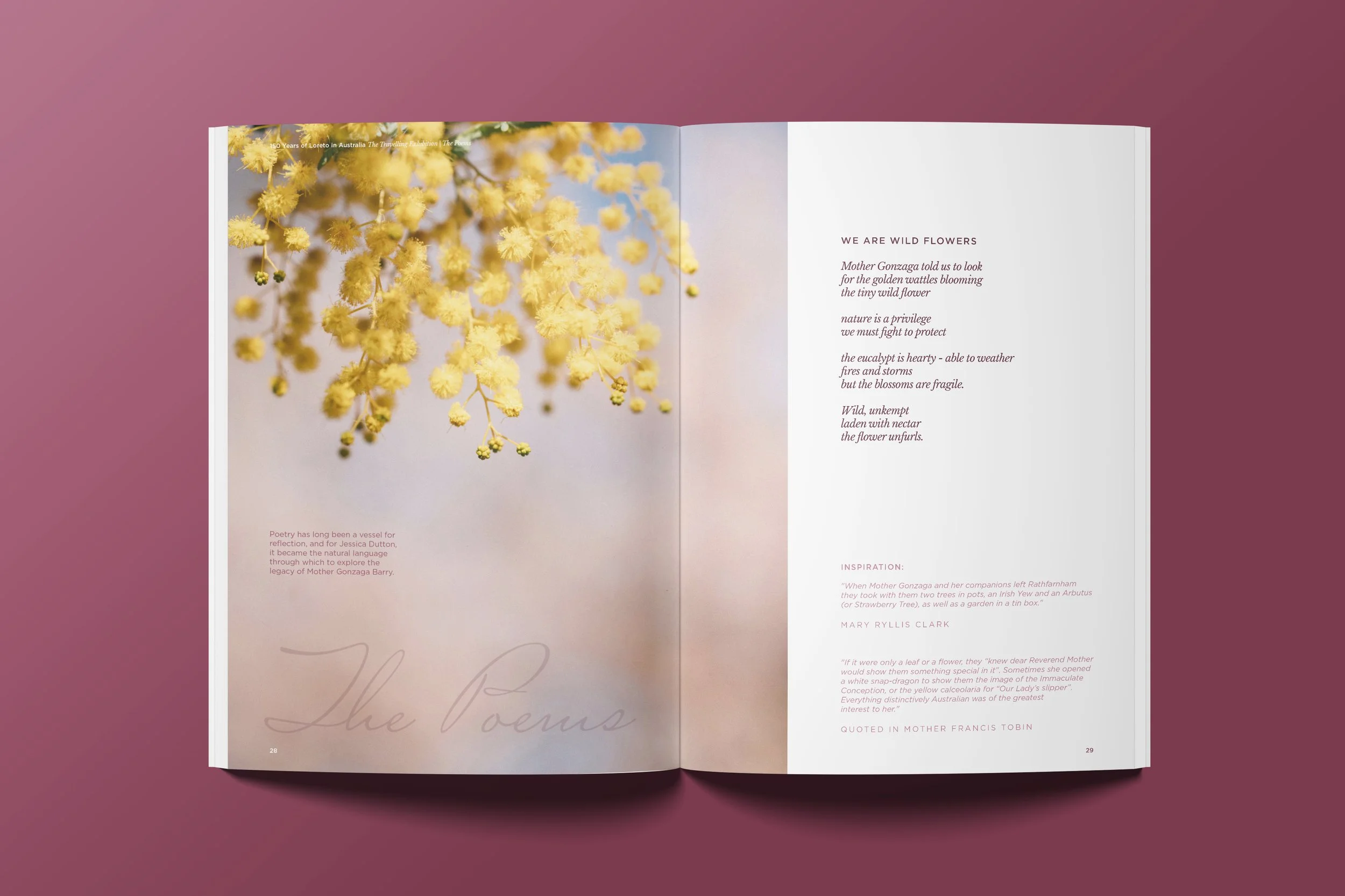
A structured chapter system opens with the pioneering Sisters and the founding story of Mother Gonzaga Barry, moves through the artwork, tagline and travelling exhibition, then devotes dedicated sections to each school community, from Ballarat and Mandeville Hall Toorak to Kirribilli, Normanhurst, Marryatville, Portland, Coorparoo and John XXIII College.
Consistent running heads, a disciplined grid and a repeating sub-section rhythm give the reader a reliable framework, while dramatic full-bleed spreads and generous space control pace and create moments of pause.
We managed the project end to end, coordinating contributors across nine school communities, sourcing and preparing archival assets of widely varying quality, and shepherding copy, poetry, artwork and testimonials through review and approval to a fixed print deadline.
We liaised directly with the printer through stock selection, colour proofing and finishing, ensuring the deep tonal fields reproduced with the richness the design demanded and that the finished object felt substantial and luxurious in the hand.
The keepsake volume gathers 150 years of people, places, and schools into one cohesive piece of visual storytelling, designed to be kept, revisited and passed on.