The Anatomy Lab
Logo, Branding & Web Design
We had the pleasure of collaborating with Nino Cvoro, the founder of Body Image PT, to undergo a significant brand transformation for his fitness and nutrition coaching business. With over 20 years of experience, Nino's philosophy has evolved to prioritise holistic well-being beyond physical appearance. The name "Body Image PT" no longer aligned with his vision, leading to the birth of The Anatomy Lab.
The new brand, The Anatomy Lab, embodies Nino's belief in the interconnectedness of physical and mental strength. It represents a deeper understanding of fitness and health, going beyond superficial notions. Working closely with Nino, we developed a visually compelling logo that combines anatomy and strength elements, capturing the essence of The Anatomy Lab's approach.
The transformation from Body Image PT to The Anatomy Lab was an inspiring journey. It highlights the power of branding to reflect an organisation's evolution and philosophy, connecting with the right audience and fostering growth and success. Working with Nino was a rewarding experience, and we are proud to have contributed to the brand's transformation and success.

STRENGTH, COMMITMENT, DISCIPLINE
Concept
During the logo ideation process for The Anatomy Lab, we focused on capturing the essence of training the mind, body, and soul. We drew inspiration from the renowned drawing of the Vitruvian Man by Leonardo da Vinci (1940), where he references the harmonious proportions of the human form. This drawing, influenced by the ancient Roman architect Vitruvius and the Humanist movement of the 15th Century, represents the perfect balance and importance of human proportions.
Leonardo da Vinci's depiction of the Vitruvian Man within a circle and square resonated deeply with Nino's training philosophy. It symbolises not only the physical body but also the mind and soul, emphasising the holistic approach to fitness and well-being that Nino advocates for. The Vitruvian Man serves as a metaphorical representation of Nino's intentions in his training methodology.
In addition, we also kept "strength" at the forefront of our minds while creating Nino's branding. Nino's unique training style is built on his discipline, both mentally and physically. The logo needed to convey this sense of strength and resilience, representing the core principles that set Nino apart.

Logo
Building upon the concept of the Vitruvian Man, we embarked on the logo creation process for The Anatomy Lab. Our goal was to infuse the ancient concept with a modern touch, incorporating geometric lines and abstract shapes to represent the mind-body-soul connection in a visually compelling way. By utilising geometric elements, we aimed to create a logo that speaks to the timeless significance of human proportions.
To add a sense of direction and visual metaphor, we deliberately positioned the geometric man off-centre. This placement not only creates an intriguing visual composition but also symbolises the journey and progress that individuals undertake in their pursuit of holistic well-being. It signifies that growth and transformation occur when we venture beyond the confines of our comfort zones.
The choice of typeface for the logo was deliberate and purposeful. We opted for a sturdy, minimal, and masculine typeface that embodies the critical concepts at the core of Nino's brand: strength, commitment, and discipline. The typography reflects the uncompromising dedication Nino brings to his training philosophy and resonates with the values he imparts to his clients.


Brand Guidelines
When developing the brand guidelines for The Anatomy Lab, we recognised the importance of striking a balance between strength and discipline while ensuring that the brand identity wasn't overly masculine. To achieve this, we focused on a carefully curated colour palette that represents the harmony between hard work and enjoyment.
The colour palette comprises stark off-blacks and whites, reminiscent of the indoor gym environment that embodies discipline and dedication. These neutral tones provide a solid foundation for the brand's visual identity. In addition, we incorporated warm colours that evoke the serene beauty of a sunrise, symbolising the connection between Nino's outdoor training sessions on Sydney Harbour in the early morning and the gym workouts. These warm hues add a touch of vibrancy, femininity and energy to the brand.
To further enhance the brand's visual appeal and create a sense of calmness and transition, we developed a gradient that can be applied across various brand assets. This gradient mimics the gentle blending of colours found in a sunrise, evoking a soothing and harmonious atmosphere. By utilising the gradient consistently, we reinforce the brand's identity and evoke a sense of serenity and balance throughout the visual elements.
The brand guidelines ensure that the visual identity of The Anatomy Lab reflects its core values of strength, discipline, and enjoyment. The careful selection of colours, from the stark neutrals to the warm sunrise hues, along with the use of gradients, creates a cohesive and engaging visual experience for the audience, capturing the essence of Nino's holistic training philosophy.


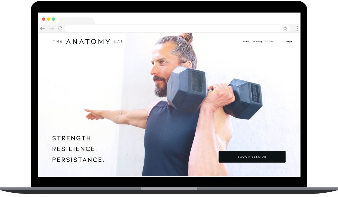
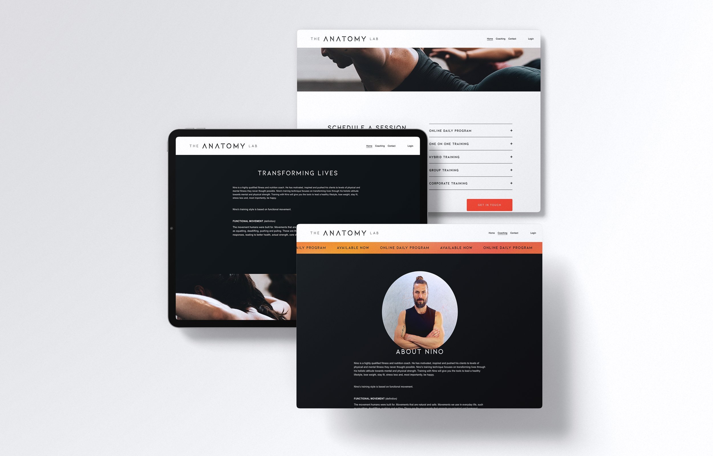
Website
Our web design for The Anatomy Lab focused on creating a user-friendly and visually captivating online experience. Key elements of the web design include:
Clean and modern layout for easy navigation and readability.
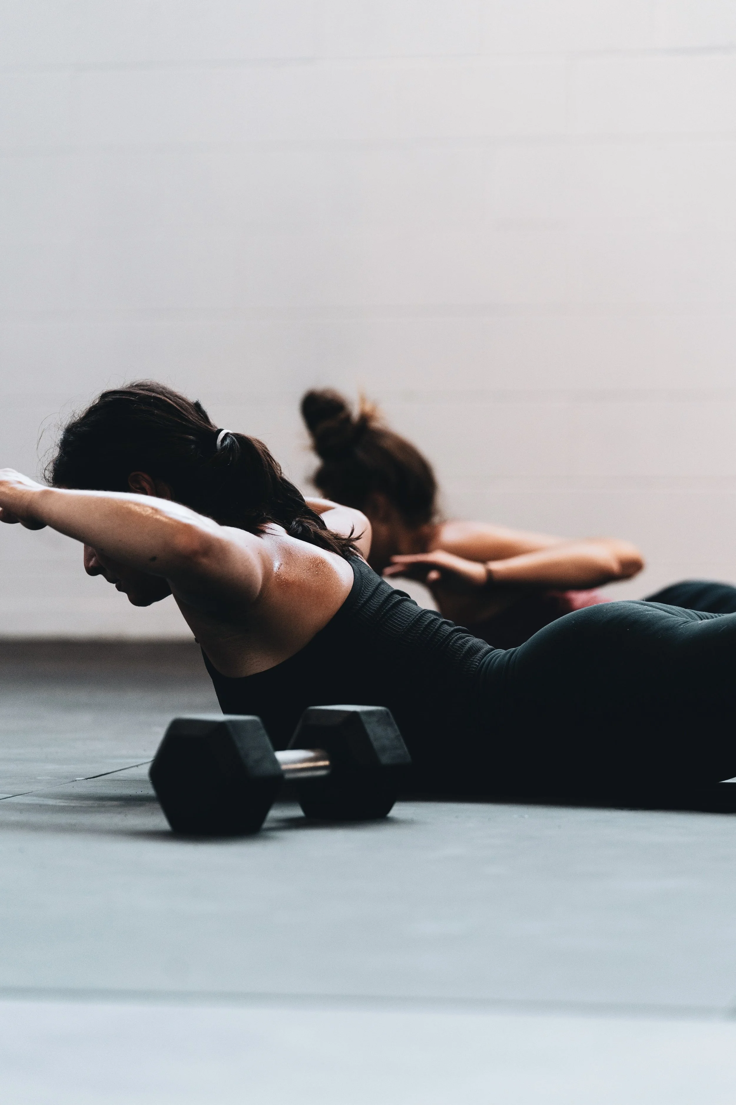
Striking imagery that showcases strength and balance in training.
Responsive design for seamless viewing on different devices.
Engaging content sections highlighting training philosophy, testimonials, programs, and events.
Prominent call-to-action buttons for user interaction.
Integration of social media for increased online presence.
User-friendly contact and booking features for easy communication and scheduling.
The result is a website that effectively represents The Anatomy Lab's brand identity and engages visitors, encouraging them to take action and explore the services offered.