


Peau + Beaute
Logo, Rebrand & Website Design
This project was undertaken in collaboration with Get You Known.
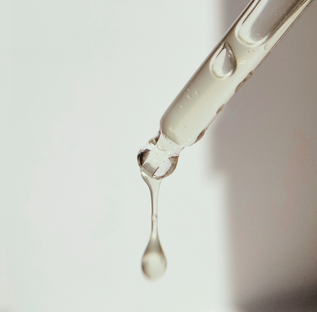
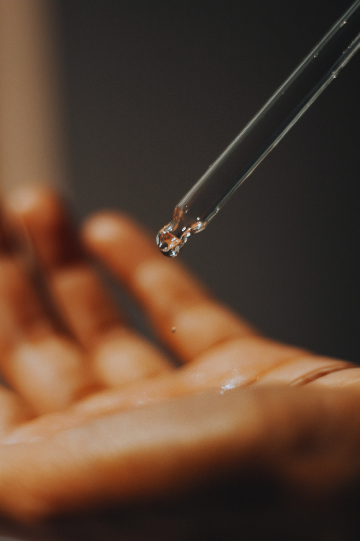
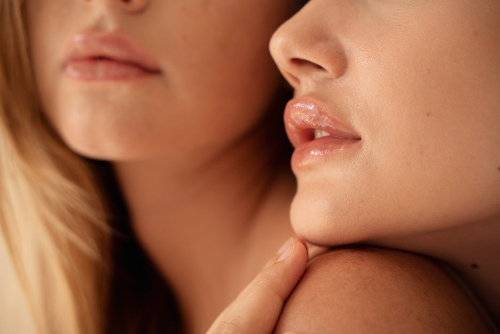
Peau & Beauté is a premium skin and cosmetics business in Surry Hills dedicated to enhancing beauty, radiance, and self-esteem through personalized services. As a business in the beauty, cosmetic, and personal care industry, Peau & Beauté offers bespoke solutions tailored to their clientele's unique needs and preferences.
Their mission is to help individuals elevate their beauty and self-confidence, and they achieve this by providing luxurious treatments that go beyond conventional beauty services.
Primary Logo
The Peau & Beauté logo is a modern serif typeface that exudes feminine luxury. It's characterized by tightly kerned, elegant letters, reflecting the brand's commitment to precision and sophistication.
The design is clean, minimalist, and typically monochromatic, emphasizing the brand's focus on quality and timelessness. The logo is scalable and consistent in its usage across various media, ensuring a strong and recognizable brand identity.

Secondary Logo
The secondary logo for Peau & Beauté is a delicate and luxurious lettermark featuring the letters "P", "&", and "B" in the same elegant serif typeface used in the primary logo. This lettermark design maintains the brand's commitment to precision and sophistication while offering a more compact and focused representation.
The "P", "&", and "B" are artfully intertwined to create a unique and memorable symbol that exudes luxury and refinement.
This secondary logo complements the primary logo and is a versatile and recognizable element of the brand's visual identity.
Colour Palette
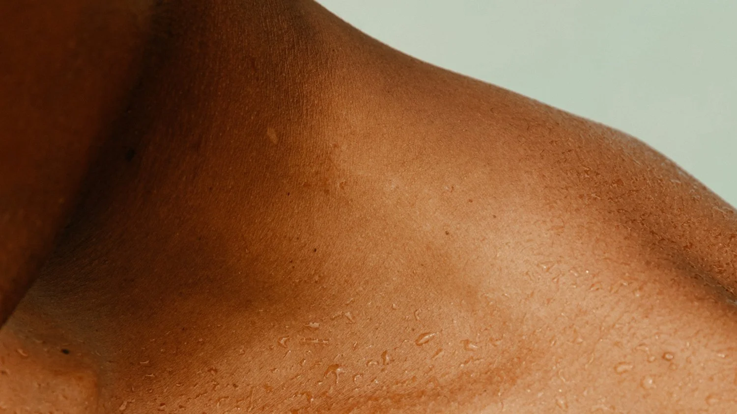
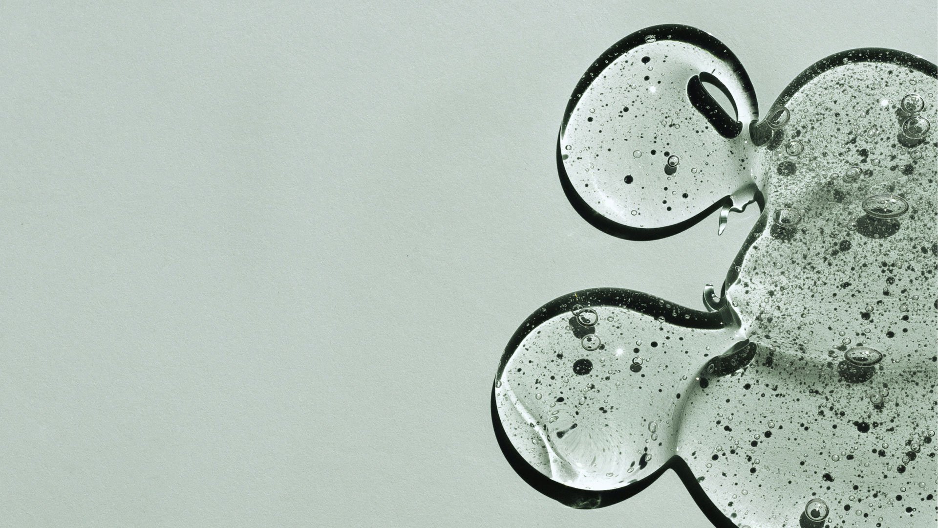
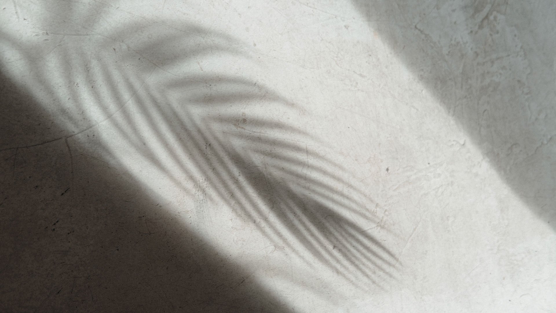
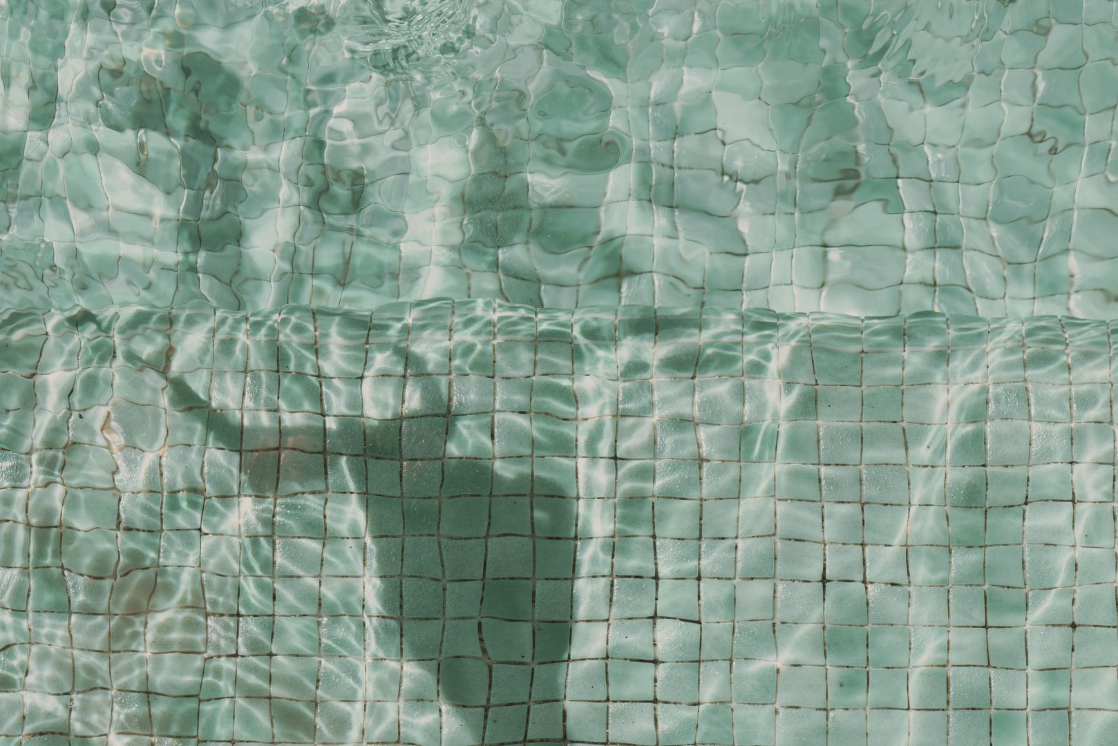
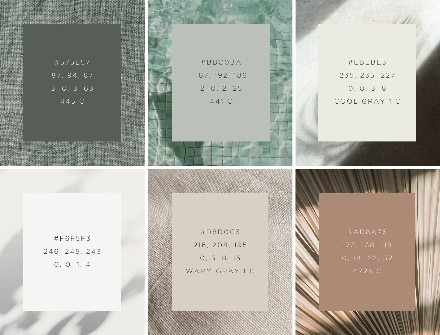
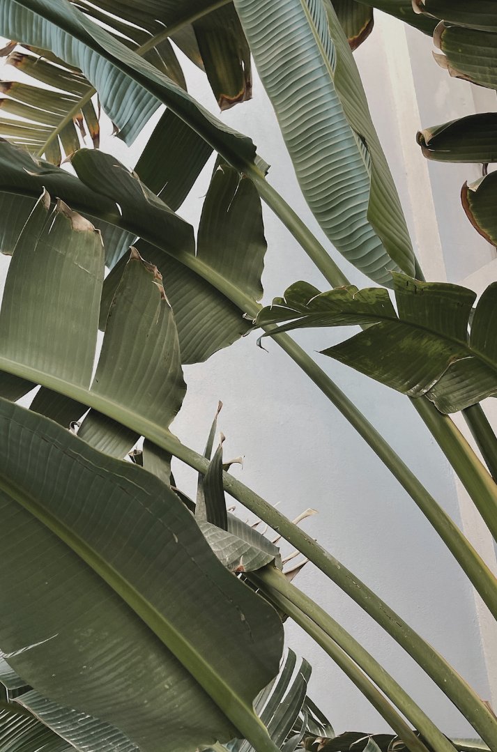
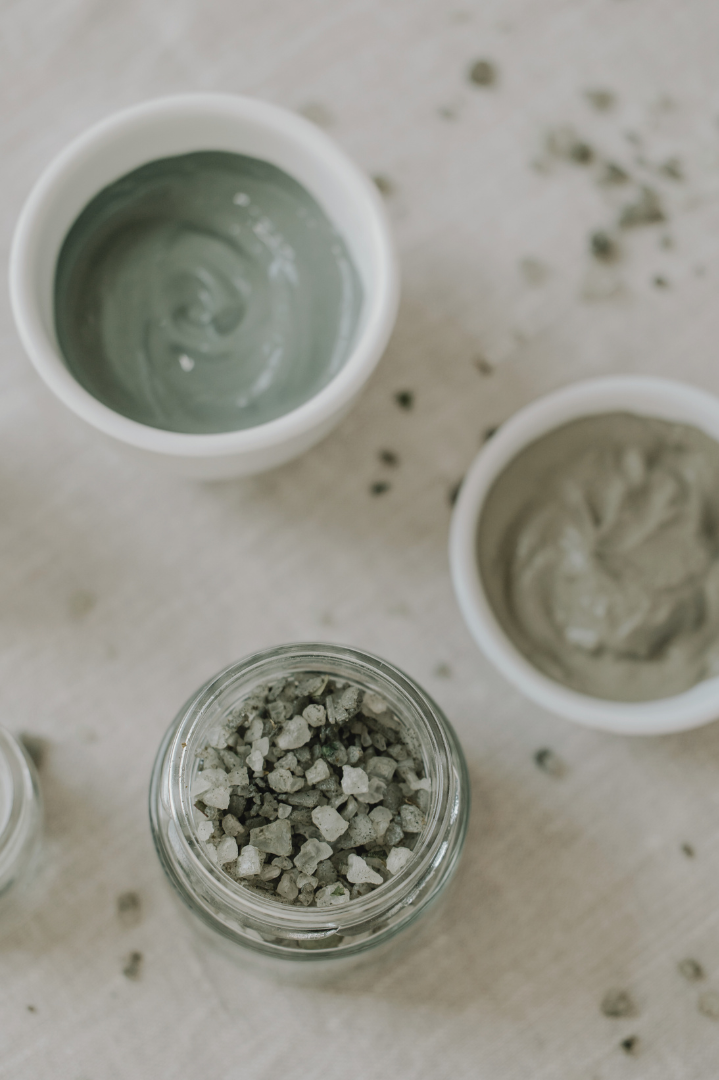
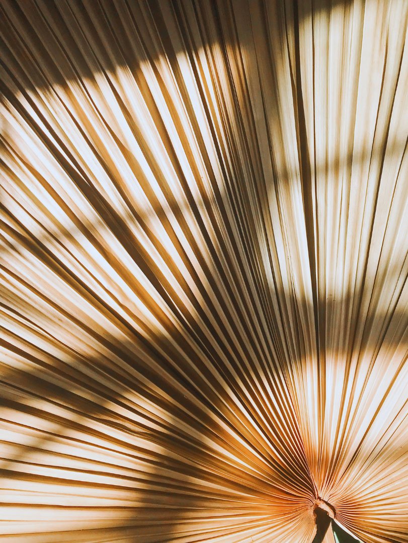
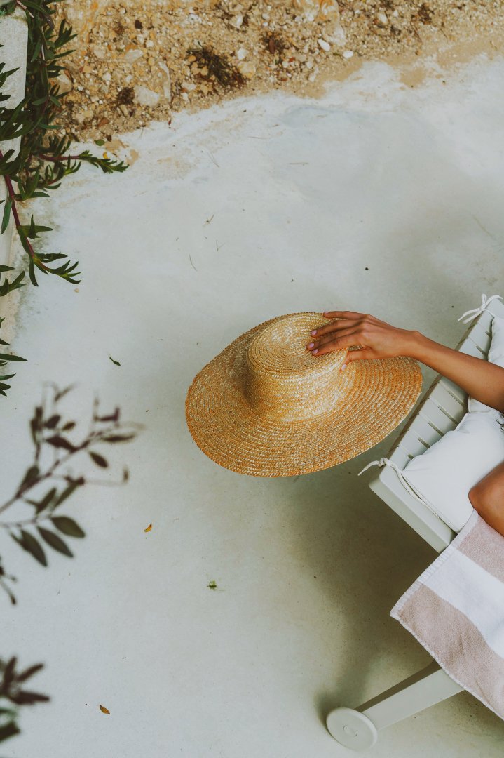
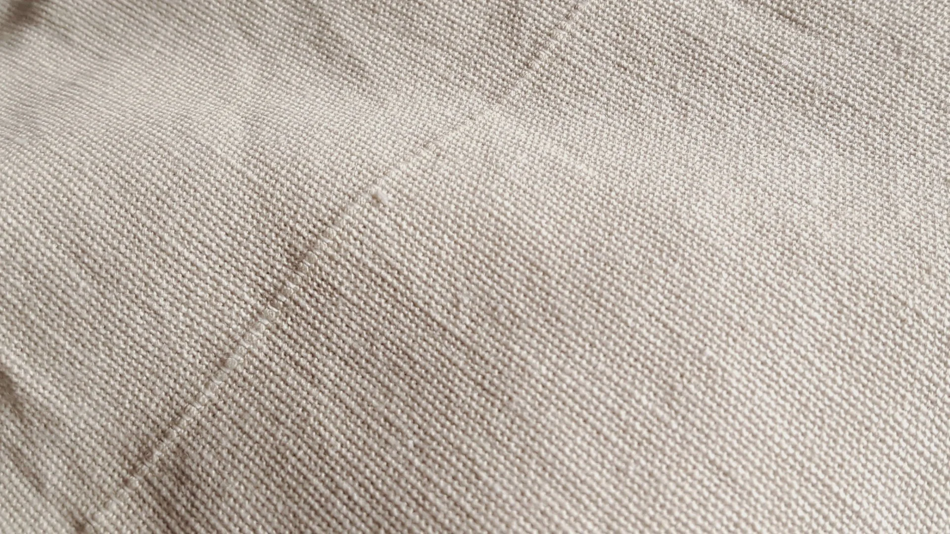
The colour palette for Peau & Beauté exudes a tranquil, resort-like spa atmosphere, primarily consisting of soft, soothing tones. The chosen colours evoke a sense of relaxation and luxury while maintaining a neutral and minimalistic aesthetic.
Soft sage green is the primary colour in the palette, offering a calming and natural feel. It symbolizes growth, tranquillity, and rejuvenation, reflecting the spa-like experience Peau & Beauté provides.
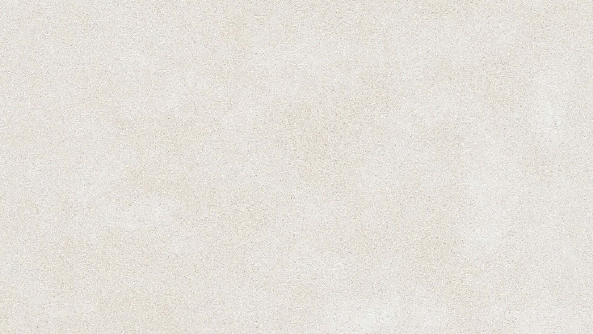
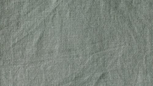
Linen hues provide a sense of purity and simplicity, reinforcing the brand's commitment to minimalism and cleanliness. These colours can be used for backgrounds and neutral accents.
The tan shades add warmth and comfort to the palette, mirroring the earthy tones often found in natural spa environments. This colour complements the sage green and linens beautifully, creating a harmonious and elegant look.
The chosen colour palette embodies a sense of serenity and refinement, inviting customers to experience the brand's bespoke and luxurious treatments in a tranquil and welcoming setting.


Website
The Peau & Beauté website embodies the serene and tranquil essence of its branding. It exudes minimalism, elegance, and tranquillity, with a focus on facilitating user inquiries about their range of services and booking treatments.
